Case Study
Case Study
Pool | Collaborative & Personal Savings
Collaborative savings platform enabling structured group financial goals and transparent contribution tracking.
Collaborative savings platform enabling structured group financial goals and transparent contribution tracking.
Problem Context
Saving toward a shared goal breaks down fast. Without one place to track who contributed what, groups fall back on messages and mental math. Pool gives everyone a shared view that updates automatically, no check-ins needed.
No clear view of who contributed what.
No clear view of who contributed what.
No clear view of who contributed what.
Progress feels abstract and unmotivating.
Progress feels abstract and unmotivating.
Progress feels abstract and unmotivating.
Asking about money creates tension.
Asking about money creates tension.
Asking about money creates tension.
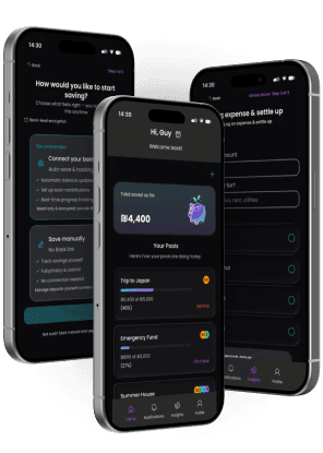
Designed in dialogue with Figma Make
Designed in dialogue with Figma Make
Key screens and component variants were explored using Figma Make as an active design partner. Generating layout alternatives, testing edge cases, and stress-testing the contribution flow before committing to final decisions.
Saving goals screen options
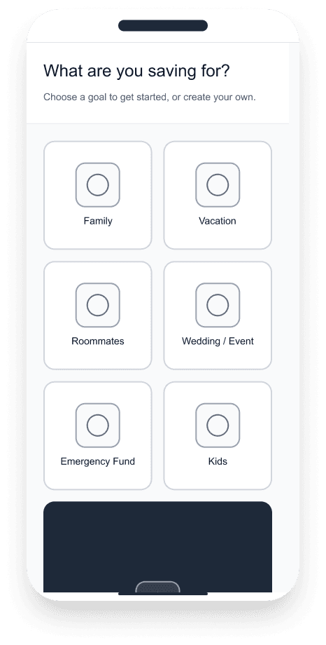
Option 1- Grid
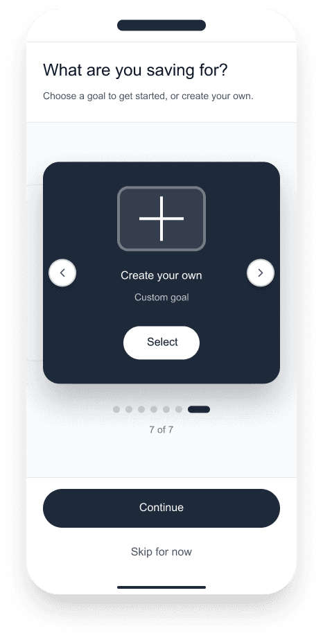
Option 2- Carousel
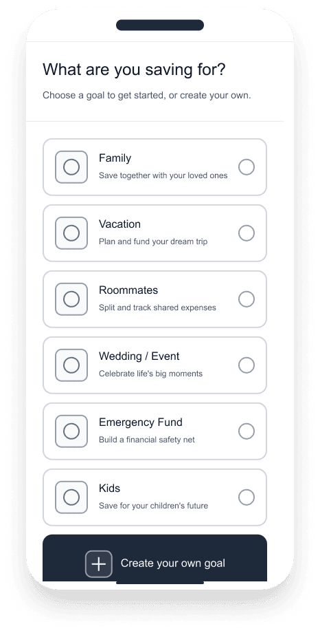
Option 3- List
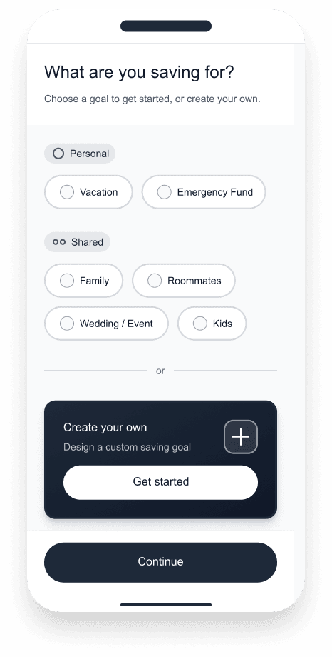
Option 4- Segments
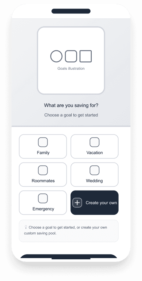
Option 5- Split
Option 1- Grid
Option 2- Carousel
Option 3- List
Option 4- Segments
Option 5- Split
Connect Bank screen options
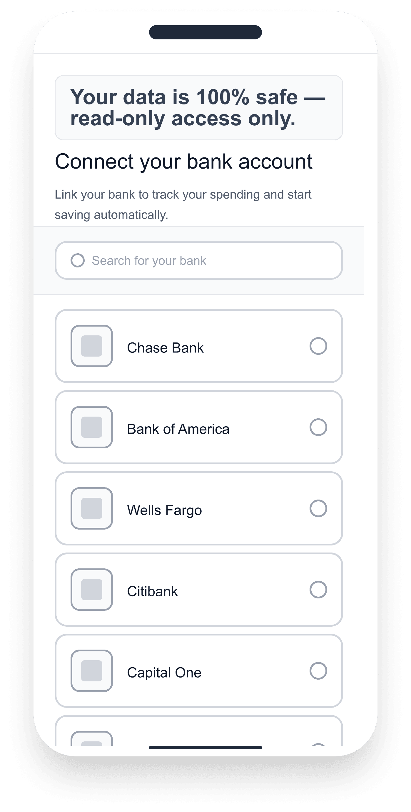
Option 1- List
Option 1- List
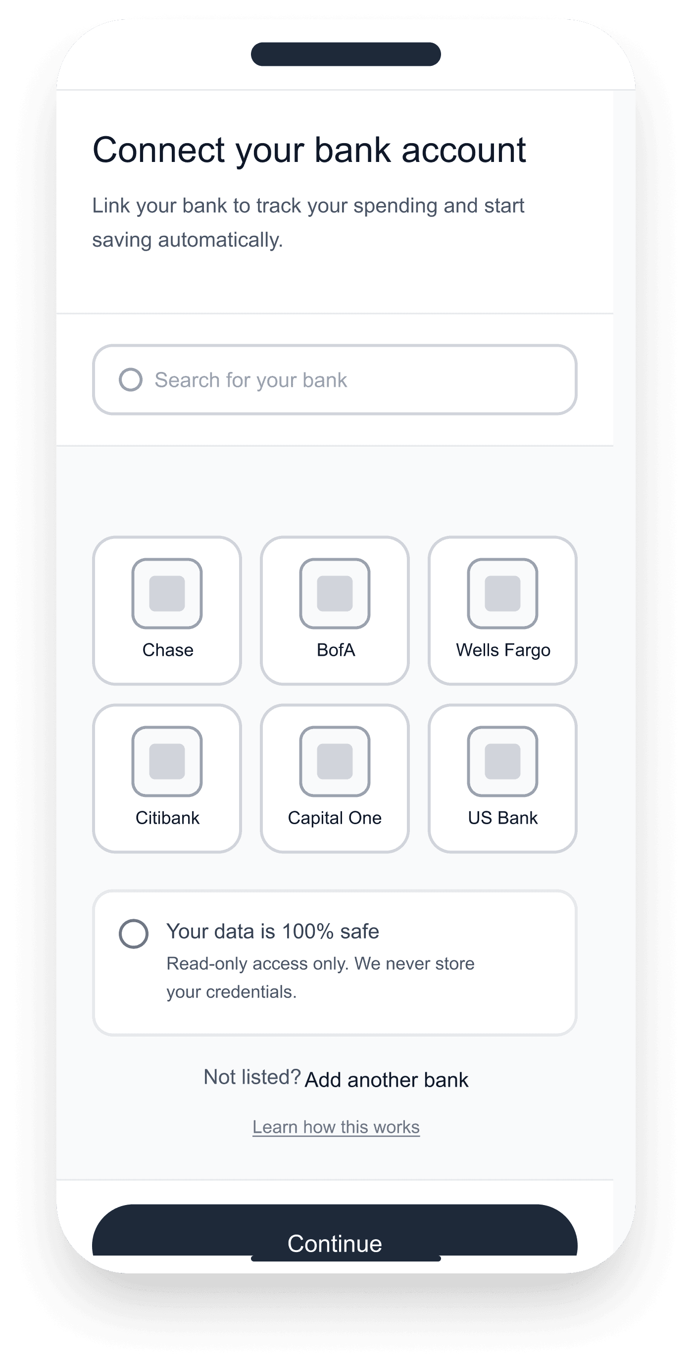
Option 2- Grid
Option 2- Grid
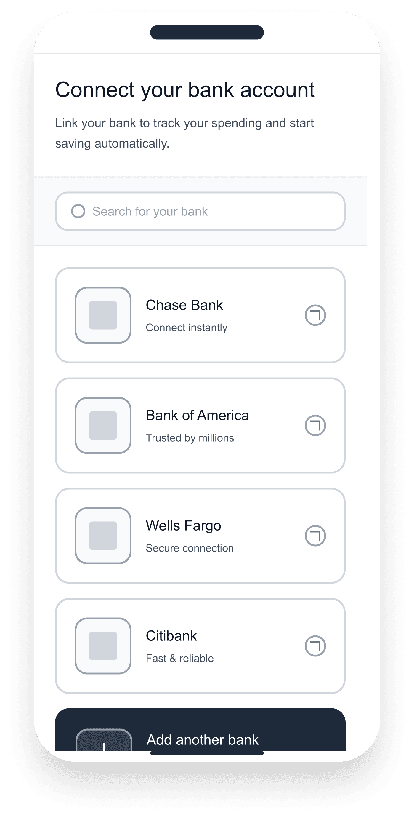
Option 3- Cards
Option 3- Cards
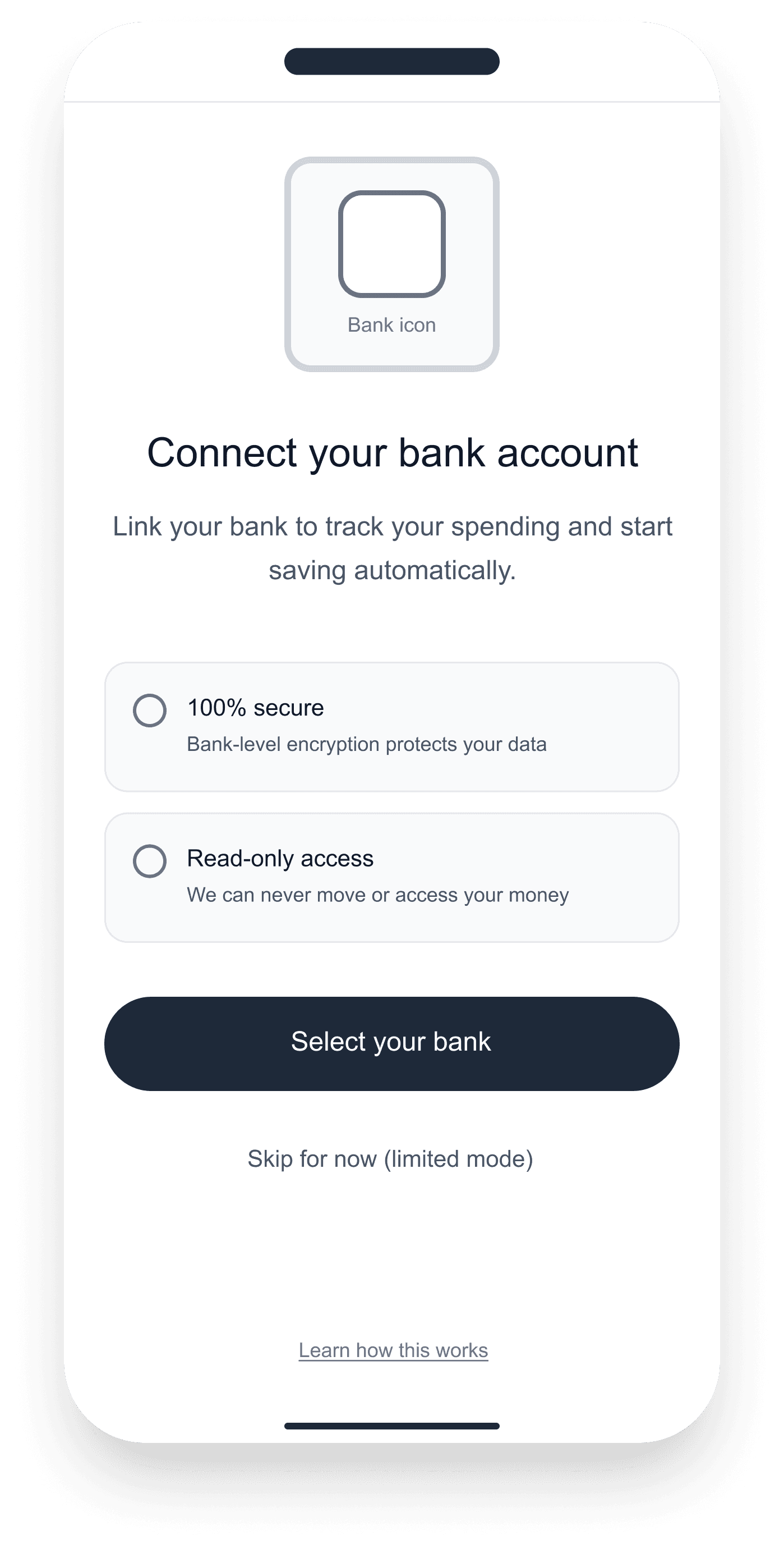
Option 4- Modal
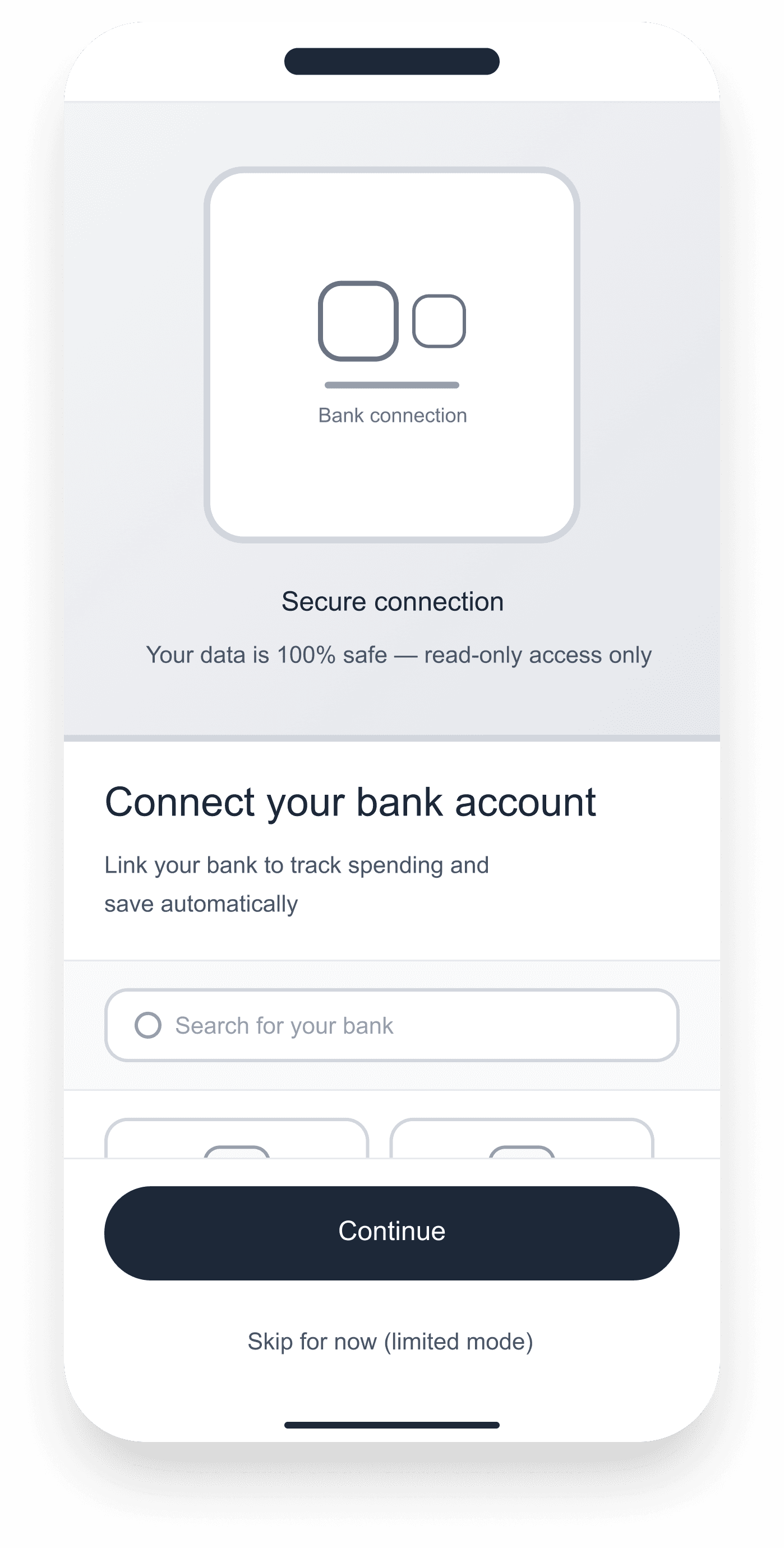
Option 5- Split
Option 5- Split
Option 1- List
Option 2- Grid
Option 3- Cards
Option 4- Modal
Option 5- Split
Design Decisions & Trade-off
Design Decisions & Trade-off
Three decisions shaped Pool. Each one had a cost, and each cost was chosen deliberately.
Spectrum, not binary
The same Pool structure serves personal goals and shared goals. People track progress the same way alone or together, so two interfaces would mean learning the same task twice. The trade-off: shared-only features like invitations and member visibility had to feel optional in personal mode, not like a second product.
Spectrum, not binary
The same Pool structure serves personal goals and shared goals. People track progress the same way alone or together, so two interfaces would mean learning the same task twice. The trade-off: shared-only features like invitations and member visibility had to feel optional in personal mode, not like a second product.
Spectrum, not binary
The same Pool structure serves personal goals and shared goals. People track progress the same way alone or together, so two interfaces would mean learning the same task twice. The trade-off: shared-only features like invitations and member visibility had to feel optional in personal mode, not like a second product.
Transparency Vs. Comparison Anxiety
Showing each member's amount removes awkward questions, but it also invites comparison. "Dan saved 32%, I saved 17%." Pool shows progress, not performance. No leaderboards, no penalties, no nudging. The trade-off: full transparency demands careful copy and visual treatment to stay supportive rather than judgmental.
Transparency Vs. Comparison Anxiety
Showing each member's amount removes awkward questions, but it also invites comparison. "Dan saved 32%, I saved 17%." Pool shows progress, not performance. No leaderboards, no penalties, no nudging. The trade-off: full transparency demands careful copy and visual treatment to stay supportive rather than judgmental.
Transparency Vs. Comparison Anxiety
Showing each member's amount removes awkward questions, but it also invites comparison. "Dan saved 32%, I saved 17%." Pool shows progress, not performance. No leaderboards, no penalties, no nudging. The trade-off: full transparency demands careful copy and visual treatment to stay supportive rather than judgmental.
Bank Connection Vs. Onboarding Friction
Bank sync makes contributions accurate and automatic, but asking for credentials is the highest-friction step in onboarding. Pool offers bank connection as the primary path and "continue without bank" as a legitimate choice, not a fallback. The trade-off: less accurate data for manual users, but no cliff that loses people before their first pool.
Bank Connection Vs. Onboarding Friction
Bank sync makes contributions accurate and automatic, but asking for credentials is the highest-friction step in onboarding. Pool offers bank connection as the primary path and "continue without bank" as a legitimate choice, not a fallback. The trade-off: less accurate data for manual users, but no cliff that loses people before their first pool.
Bank Connection Vs. Onboarding Friction
Bank sync makes contributions accurate and automatic, but asking for credentials is the highest-friction step in onboarding. Pool offers bank connection as the primary path and "continue without bank" as a legitimate choice, not a fallback. The trade-off: less accurate data for manual users, but no cliff that loses people before their first pool.
One Mental Model
One Mental Model
Pool is built around one idea: define a target, track contributions, see where things stand. Whether saving alone or with a group, the structure is identical. One goal, one pool, one shared view of progress.
System Design
System Design
The system is built around a single contribution model, transparent, role-based, and immutable. Four layers govern how money moves, who sees what, and how the interface responds automatically.
1 - Contribution rules
Each pool defines its own input method and split logic, manual or bank-synced.
2 - Goal tracking
Progress is calculated automatically from validated transactions, no manual updates needed.
3 - Member roles
Visibility and permission rules are set at pool creation, no one can move money without an explicit action.
4 - Transparency layer
Every member sees a shared live view of progress and individual inputs, updated on every validated transaction.
1 - Contribution rules
Each pool defines its own input method and split logic, manual or bank-synced.
2 - Goal tracking
Progress is calculated automatically from validated transactions, no manual updates needed.
3 - Member roles
Visibility and permission rules are set at pool creation, no one can move money without an explicit action.
4 - Transparency layer
Every member sees a shared live view of progress and individual inputs, updated on every validated transaction.
The diagram below maps how these four layers translate into the token architecture. Foundation tokens define the grid and spacing rules. Surface and action tokens govern how contribution states appear. Status tokens trigger automatic responses when a payment is late or a goal is reached. Real-time goal tracking sits at the top, always visible, always current.
Token: surface/card
Token: surface/card
Token: surface/card
Scalable semantic architecture
Scalable semantic architecture
Scalable semantic architecture
Token: status/warning
Token: status/warning
Token: status/warning
Automated state response
Automated state response
Automated state response
Foundation: Radius-md
Foundation: Radius-md
Foundation: Radius-md
Modular system rule
Modular system rule
Modular system rule
Token: action/primary/bg
Token: action/primary/bg
Token: action/primary/bg
Predictable financial pattern
Predictable financial pattern
Predictable financial pattern
Token: surface/stack
Token: surface/stack
Token: surface/stack
Data-driven member display
Data-driven member display
Data-driven member display
Token: text/secondary
Token: text/secondary
Token: text/secondary
Real-time goal tracking
Real-time goal tracking
Real-time goal tracking
Token: text/primary
Token: text/primary
Token: text/primary
Predictable visual rhythm
Predictable visual rhythm
Predictable visual rhythm
Foundation: Spacing-md
Foundation: Spacing-md
Foundation: Spacing-md
Strict grid for visual trust
Strict grid for visual trust
Strict grid for visual trust
Key Screens
Core user flows demonstrating contribution clarity and shared visibility.
Core user flows demonstrating contribution clarity and shared visibility.
Shared Progress
Shared Progress
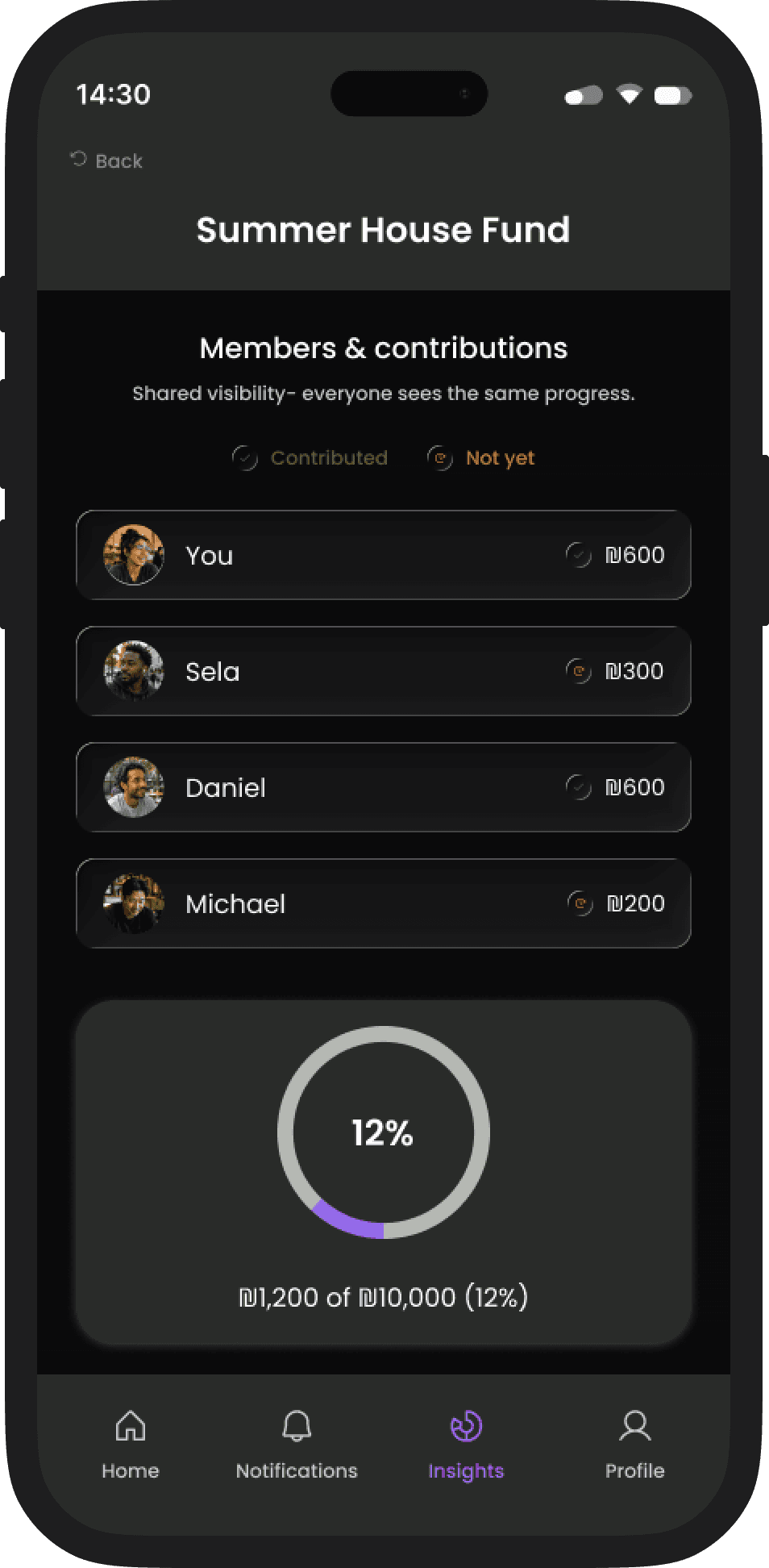
What this solves: group members can see who contributed and who hasn't, without anyone needing to ask.
What this solves: group members can see who contributed and who hasn't, without anyone needing to ask.
Transparency
Group accountability
Passive visibility
Contribution status is visible at a glance (Contributed / Not yet)
Contribution status is visible at a glance (Contributed / Not yet)
One shared view keeps accountability calm and consistent
One shared view keeps accountability calm and consistent
Contribution Flow
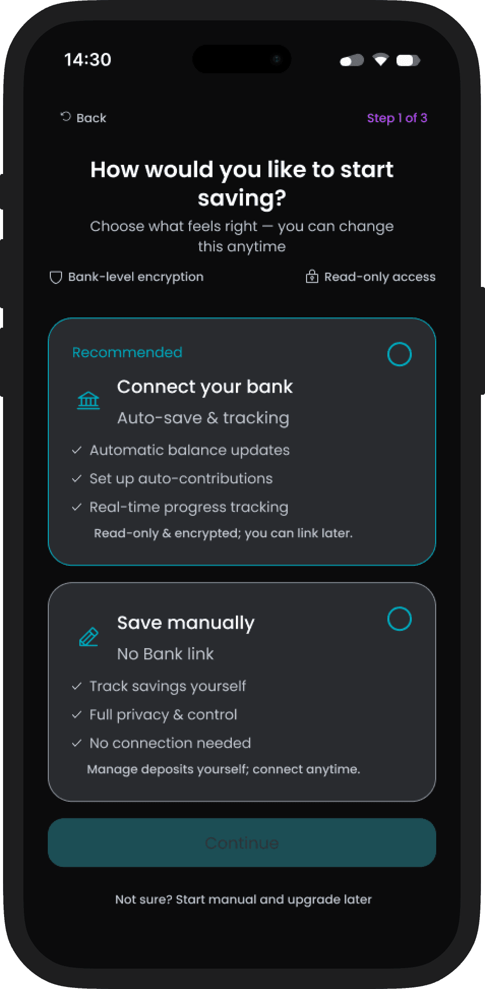
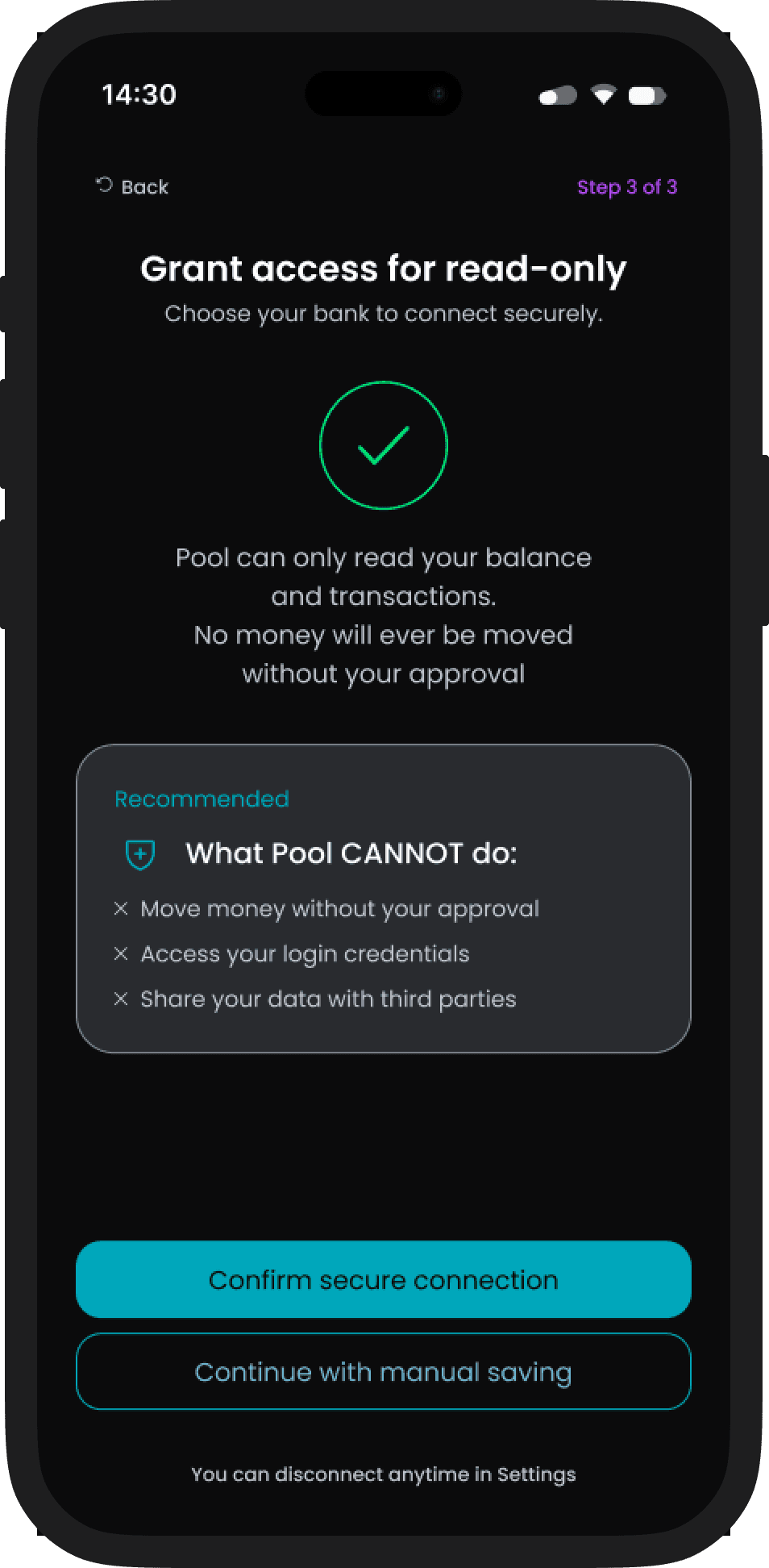
What this enables: flexible inputs that feed the same shared model, whether you log manually or sync a bank.
What this enables: flexible inputs that feed the same shared model, whether you log manually or sync a bank.
What this enables: flexible inputs that feed the same shared model, whether you log manually or sync a bank.
Flexible input
Read-only bank sync
Trust by design
Start manual, connect later, read-only bank sync is optional
Progress is calculated the same way regardless of input method
Log expense & settle up
Log expense & settle up
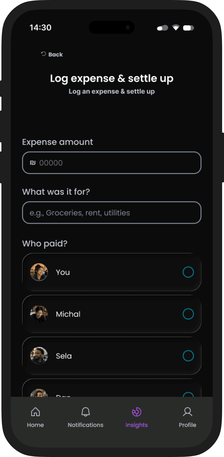
What this supports: logging shared costs and settling up without turning money into a social tension point.
What this supports: logging shared costs and settling up without turning money into a social tension point.
Expense logging
Settle up
No social friction
Quick logging with smart defaults for common shared costs
Quick logging with smart defaults for common shared costs
Clear settlements when it’s time to balance
Clear settlements when it’s time to balance
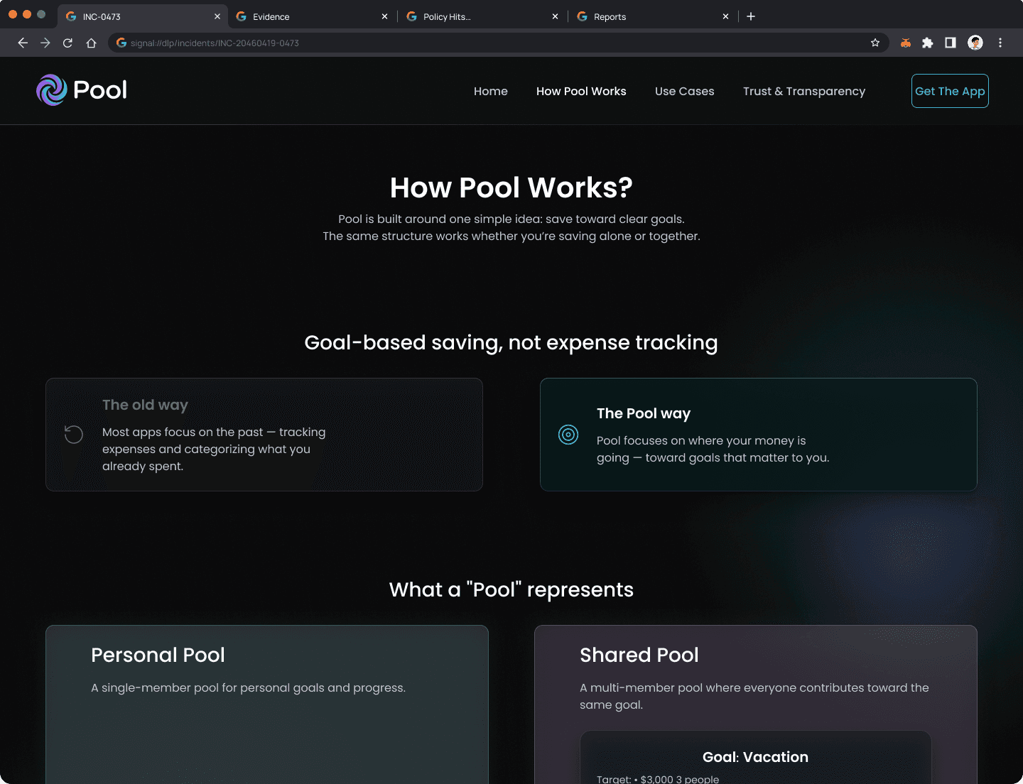
People don't download financial apps on impulse. They need to understand the model, trust the product with their bank, and feel confident it won't create friction in their group. The app can't answer those questions alone, so I designed a companion marketing site as part of the product experience, sharing the same tokens, voice, and color system.
People don't download financial apps on impulse. They need to understand the model, trust the product with their bank, and feel confident it won't create friction in their group. The app can't answer those questions alone, so I designed a companion marketing site as part of the product experience, sharing the same tokens, voice, and color system.
The App Needed a Front Door
The App Needed a Front Door
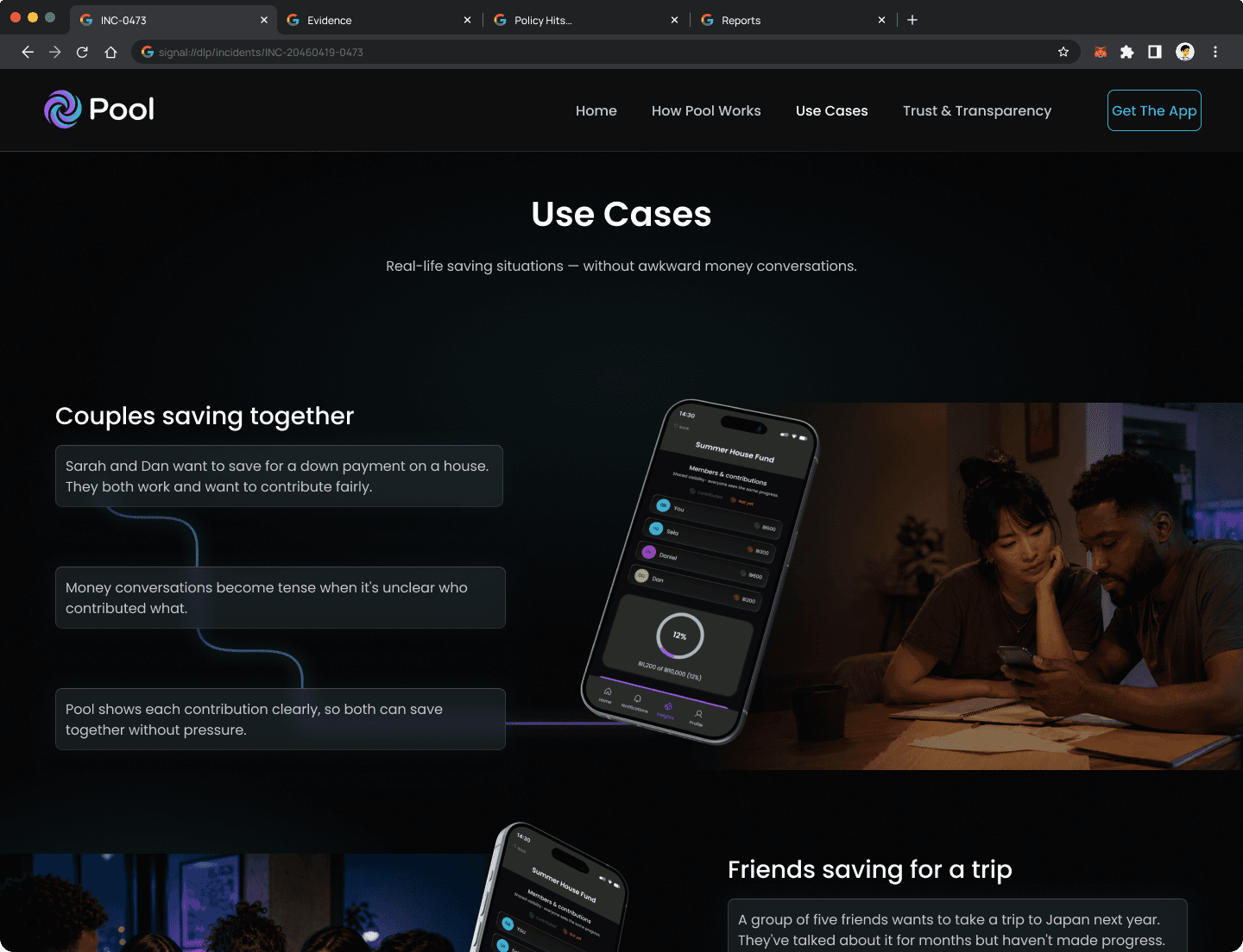
The Trust & Transparency page was designed to answer the question every potential user is silently asking before they hit download.
The Trust & Transparency page was designed to answer the question every potential user is silently asking before they hit download.
Outcome
Pool demonstrates that shared saving can work when the system removes the social friction. One mental model for solo and group goals, contribution status visible at a glance, and explicit read-only boundaries let people save together without asking where the money went.
Pool demonstrates that shared saving can work when the system removes the social friction. One mental model for solo and group goals, contribution status visible at a glance, and explicit read-only boundaries let people save together without asking where the money went.
What I'd measure
Goal Completion Rate
Did the group reach its savings target? This is the core promise of Pool. Low completion signals either unrealistic goals or contribution drop-off along the way.
Goal Completion Rate
Did the group reach its savings target? This is the core promise of Pool. Low completion signals either unrealistic goals or contribution drop-off along the way.
Active Participation Rate
How many group members contribute consistently over time? One active member in a group of four is a UX failure, not a user failure.
Active Participation Rate
How many group members contribute consistently over time? One active member in a group of four is a UX failure, not a user failure.
Bank Connect Completion
What share of users who start the bank sync flow complete it? Drop-off here signals a trust or clarity problem in the permissions screen.
Bank Connect Completion
What share of users who start the bank sync flow complete it? Drop-off here signals a trust or clarity problem in the permissions screen.
What This Proves
People don't save in fundamentally different ways alone or with others. They set a target, watch progress, adjust pace. Treating shared saving as a configuration of personal saving, rather than a separate product, cut cognitive overhead without closing the door on group dynamics. Every trust control and manual escape hatch serves one thesis: design that respects users' agency over their money.
People don't save in fundamentally different ways alone or with others. They set a target, watch progress, adjust pace. Treating shared saving as a configuration of personal saving, rather than a separate product, cut cognitive overhead without closing the door on group dynamics. Every trust control and manual escape hatch serves one thesis: design that respects users' agency over their money.
If the work made sense to you,
let's talk.
If the work made sense to you,
let's talk.
© 2026 Guy Bar-Sinai