Case Study
Case Study
Case Study

Pool | Collaborative & Personal Savings

AI-powered civic platform simplifying eligibility, document workflows, and public service processes.

Role: Product Design

Deliverables: App prototype + marketing website

Focus: Transparency & trust

Problem Context

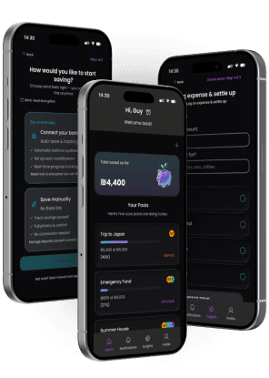
Saving toward a shared goal breaks down fast. Without one place to track who contributed what, groups fall back on messages and mental math. Pool gives everyone a shared view that updates automatically, no check-ins needed.
No clear view of who contributed what.

No clear view of who contributed what.

No clear view of who contributed what.

Progress feels abstract and unmotivating.

Progress feels abstract and unmotivating.

Progress feels abstract and unmotivating.

Asking about money creates tension.

Asking about money creates tension.

Asking about money creates tension.

Designed in dialogue with Figma Make

Key screens and component variants were explored using Figma Make as an active design partner. Generating layout alternatives, testing edge cases, and stress-testing the contribution flow before committing to final decisions.

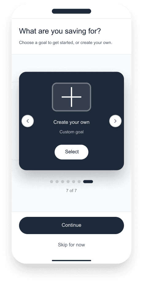
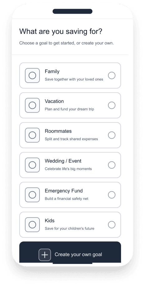
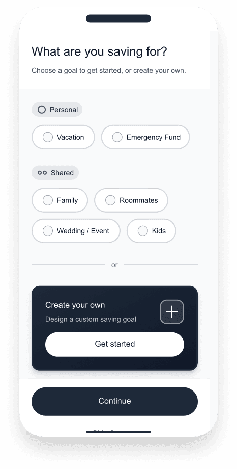
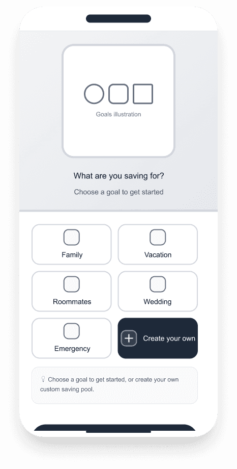
Saving goals screen options
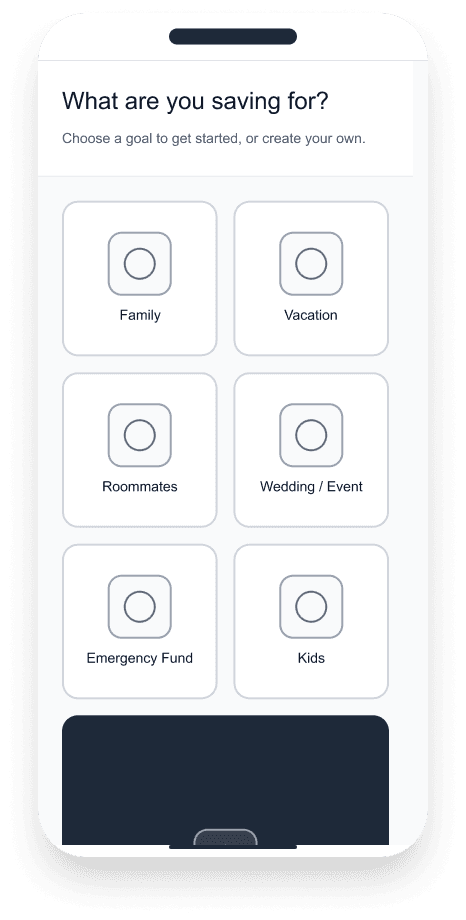
Option 1- Grid

Option 2- Carousel

Option 3- List

Option 4- Segments

Option 5- Split

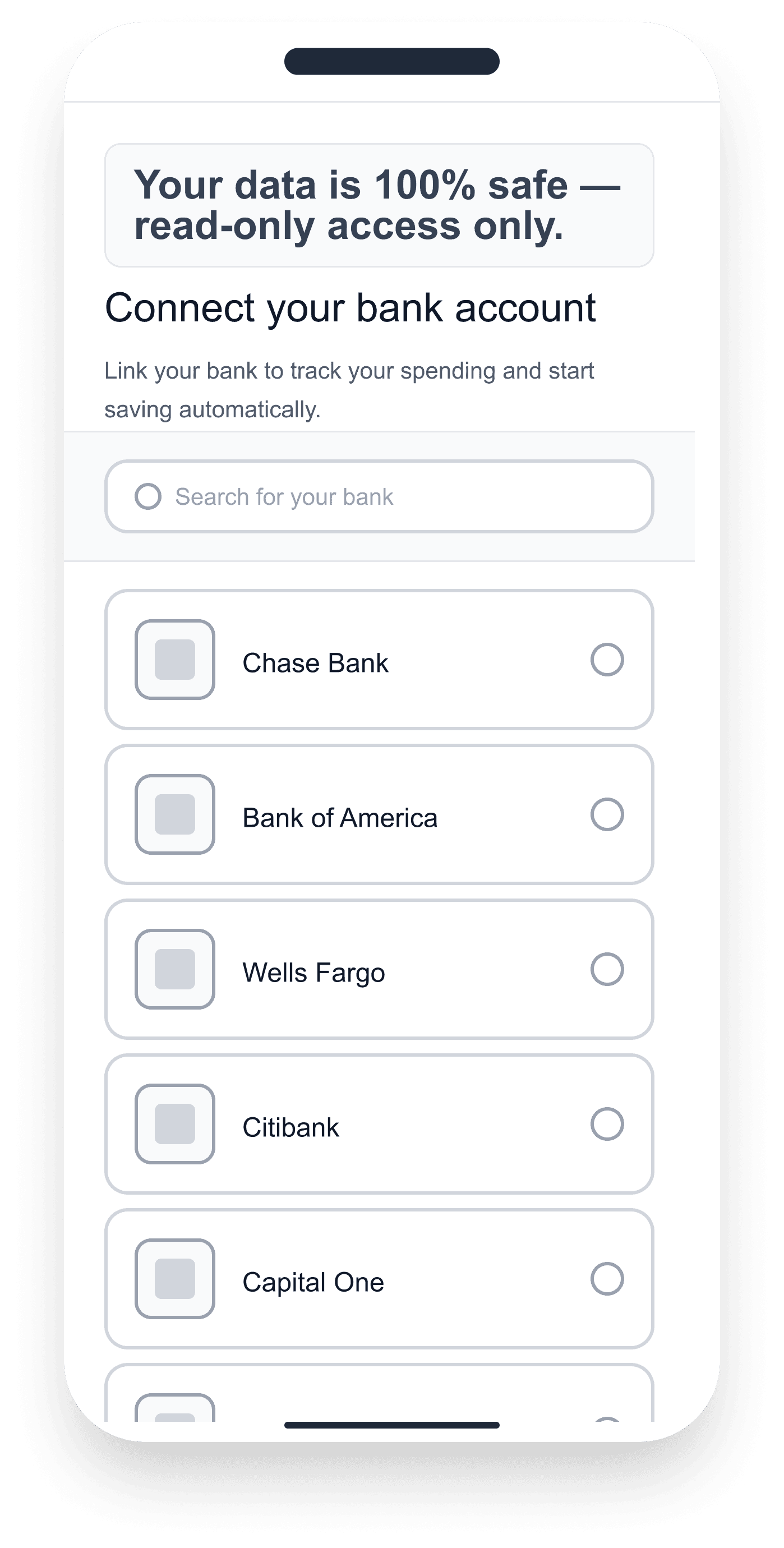
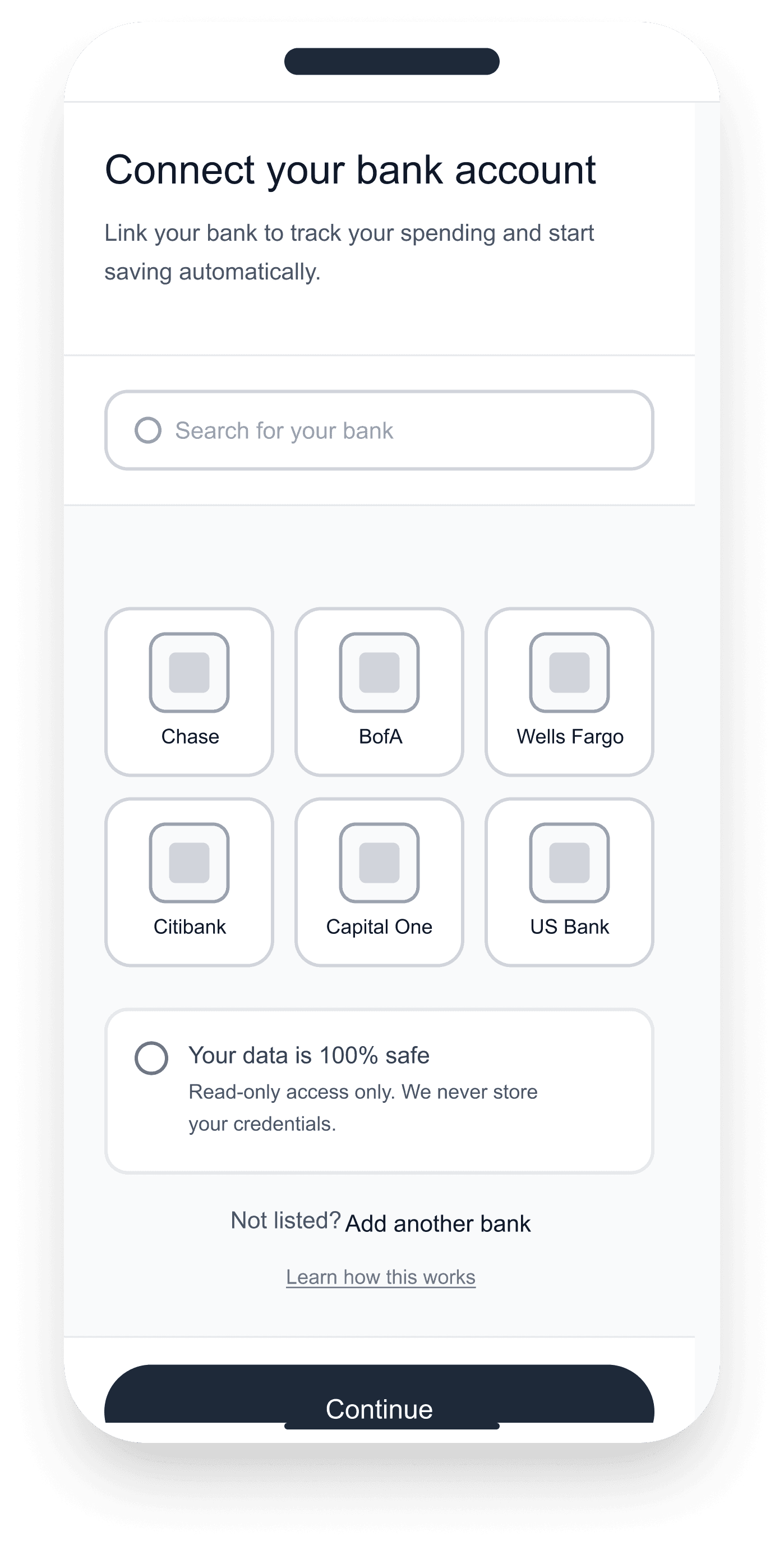
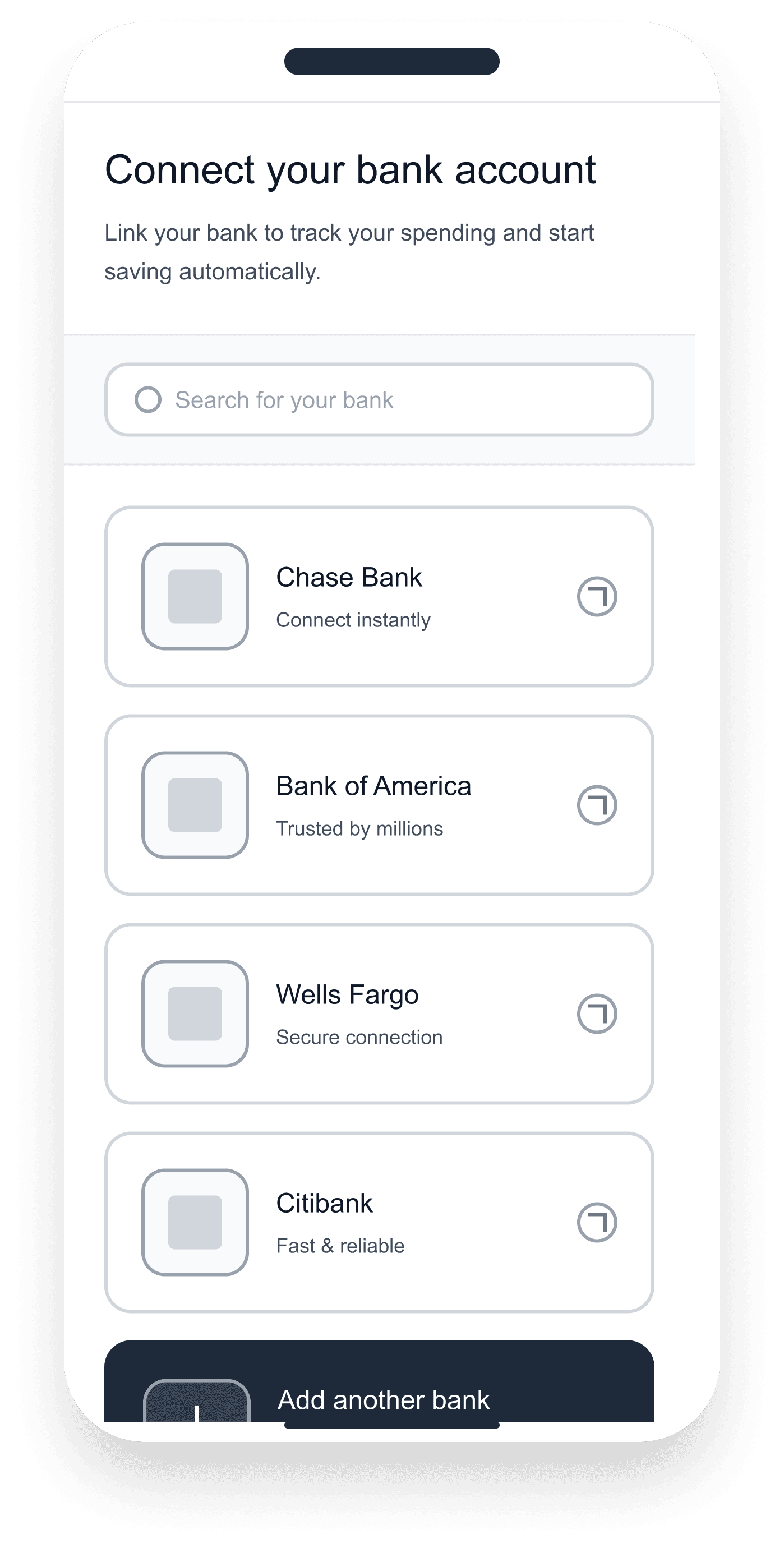
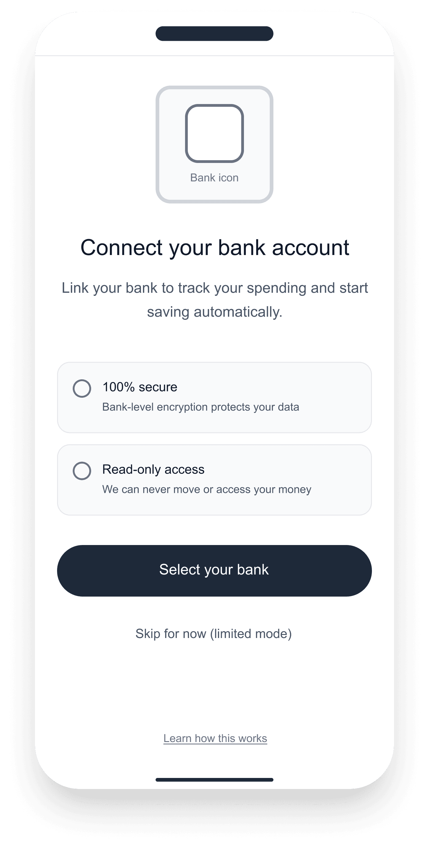
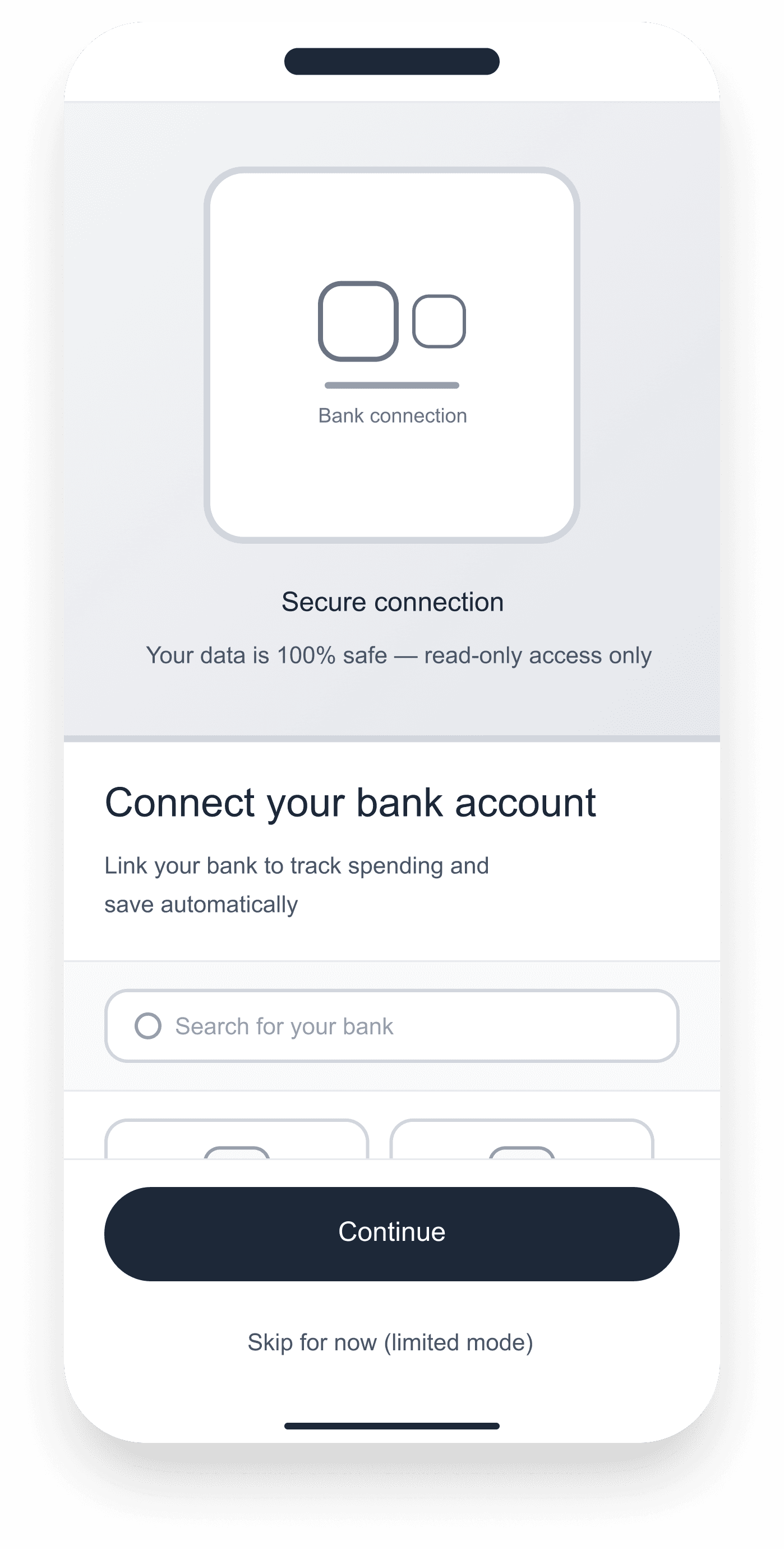
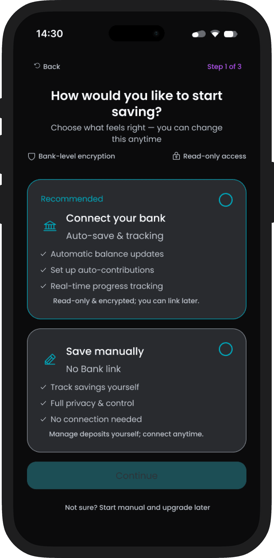
Connect Bank screen options

Option 1- List

Option 1- List

Option 2- Grid

Option 2- Grid

Option 3- Cards

Option 3- Cards

Option 4- Modal

Option 5- Split

Option 5- Split

Design Decisions & Trade-off

Key screens and component variants were explored using Figma Make as an active design partner. Generating layout alternatives, testing edge cases, and stress-testing the contribution flow before committing to final decisions.

Decision

Spectrum, not binary

The same Pool structure works for personal goals (1 contributor) and shared goals (2+ contributors). Reality has a single underlying need: track progress toward something specific. Splitting this into separate experiences would force users to learn two interfaces for the same mental task. By keeping the structure identical, a user learns Pool once and reuses it across every saving context. The trade-off: features that only make sense in shared mode (invitations, member visibility, contribution attribution) had to feel optional in personal mode, never as separate UI.

Decision

Spectrum, not binary

The same Pool structure works for personal goals (1 contributor) and shared goals (2+ contributors). Reality has a single underlying need: track progress toward something specific. Splitting this into separate experiences would force users to learn two interfaces for the same mental task. By keeping the structure identical, a user learns Pool once and reuses it across every saving context. The trade-off: features that only make sense in shared mode (invitations, member visibility, contribution attribution) had to feel optional in personal mode, never as separate UI.

Decision

Spectrum, not binary

The same Pool structure works for personal goals (1 contributor) and shared goals (2+ contributors). Reality has a single underlying need: track progress toward something specific. Splitting this into separate experiences would force users to learn two interfaces for the same mental task. By keeping the structure identical, a user learns Pool once and reuses it across every saving context. The trade-off: features that only make sense in shared mode (invitations, member visibility, contribution attribution) had to feel optional in personal mode, never as separate UI.

Trade-off

Transparency Vs. Comparison Anxiety

Showing each contributor's individual amount in shared pools removes the need for awkward questions and hidden assumptions. But the same transparency also creates visible comparison: "Dan saved 32%, I saved 17%". The risk is shame or social pressure. The mitigation: Pool shows progress, not performance. No leaderboards, no penalties, no nudging notifications. Members see contributions but the UI never frames them as competition or ranks them by amount. The trade-off was conscious: full transparency requires careful copy and visual treatment to stay supportive, not judgmental.

Trade-off

Transparency Vs. Comparison Anxiety

Showing each contributor's individual amount in shared pools removes the need for awkward questions and hidden assumptions. But the same transparency also creates visible comparison: "Dan saved 32%, I saved 17%". The risk is shame or social pressure. The mitigation: Pool shows progress, not performance. No leaderboards, no penalties, no nudging notifications. Members see contributions but the UI never frames them as competition or ranks them by amount. The trade-off was conscious: full transparency requires careful copy and visual treatment to stay supportive, not judgmental.

Trade-off

Transparency Vs. Comparison Anxiety

Showing each contributor's individual amount in shared pools removes the need for awkward questions and hidden assumptions. But the same transparency also creates visible comparison: "Dan saved 32%, I saved 17%". The risk is shame or social pressure. The mitigation: Pool shows progress, not performance. No leaderboards, no penalties, no nudging notifications. Members see contributions but the UI never frames them as competition or ranks them by amount. The trade-off was conscious: full transparency requires careful copy and visual treatment to stay supportive, not judgmental.

Trade-off

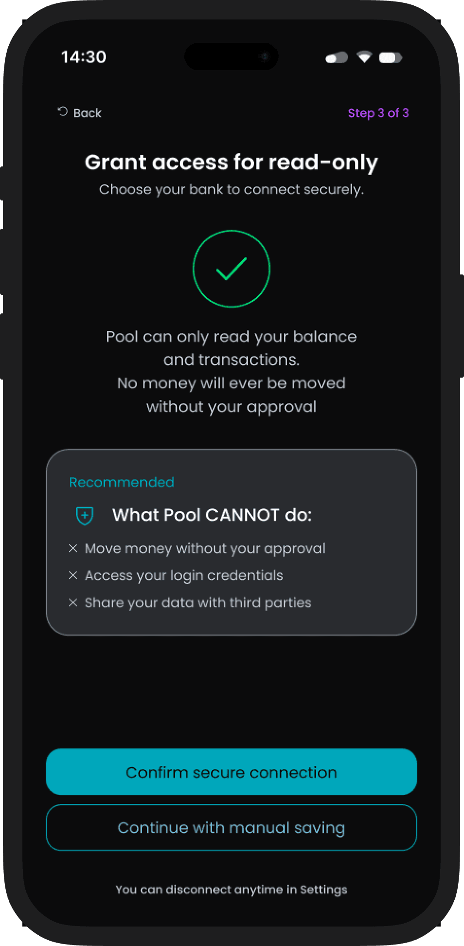
Bank Connection Vs. Onboarding Friction

Connecting to a bank account makes contributions accurate and automatic - the gold standard for fintech UX. But asking for bank credentials is the highest-friction step in any onboarding flow. Many users drop off here. The decision: offer bank connection as the primary path through a trusted intermediary, but always provide a secondary "continue without bank" exit, framed as a legitimate choice rather than a fallback. The trade-off: less accurate data for manual-entry users, but no onboarding cliff that loses people before they create their first pool.

Trade-off

Bank Connection Vs. Onboarding Friction

Connecting to a bank account makes contributions accurate and automatic - the gold standard for fintech UX. But asking for bank credentials is the highest-friction step in any onboarding flow. Many users drop off here. The decision: offer bank connection as the primary path through a trusted intermediary, but always provide a secondary "continue without bank" exit, framed as a legitimate choice rather than a fallback. The trade-off: less accurate data for manual-entry users, but no onboarding cliff that loses people before they create their first pool.

Trade-off

Bank Connection Vs. Onboarding Friction

Connecting to a bank account makes contributions accurate and automatic - the gold standard for fintech UX. But asking for bank credentials is the highest-friction step in any onboarding flow. Many users drop off here. The decision: offer bank connection as the primary path through a trusted intermediary, but always provide a secondary "continue without bank" exit, framed as a legitimate choice rather than a fallback. The trade-off: less accurate data for manual-entry users, but no onboarding cliff that loses people before they create their first pool.

If the work made sense to you,

let's talk.

One Mental Model

Pool is built around one idea: define a target, track contributions, see where things stand. Whether saving alone or with a group, the structure is identical — one goal, one pool, one shared view of progress. This single mental model drives every screen in the product.
System Design

The system is built around a single contribution model, transparent, role-based, and immutable. Four layers govern how money moves, who sees what, and how the interface responds automatically.

1 - Contribution rules

Each pool defines its own input method and split logic, manual or bank-synced.

2 - Goal tracking

Progress is calculated automatically from validated transactions, no manual updates needed.

3 - Member roles

Visibility and permission rules are set at pool creation, no one can move money without an explicit action.

4 - Transparency layer

Every member sees a shared live view of progress and individual inputs, updated on every validated transaction.

The diagram below maps how these four layers translate into the token architecture. Foundation tokens define the grid and spacing rules. Surface and action tokens govern how contribution states appear. Status tokens trigger automatic responses when a payment is late or a goal is reached. Real-time goal tracking sits at the top, always visible, always current.

Token: surface/card

Token: surface/card

Token: surface/card

Scalable semantic architecture

Scalable semantic architecture

Scalable semantic architecture

Token: status/warning

Token: status/warning

Token: status/warning

Automated state response

Automated state response

Automated state response

Foundation: Radius-md

Foundation: Radius-md

Foundation: Radius-md

Modular system rule

Modular system rule

Modular system rule

Token: action/primary/bg

Token: action/primary/bg

Token: action/primary/bg

Predictable financial pattern

Predictable financial pattern

Predictable financial pattern

Token: surface/stack

Token: surface/stack

Token: surface/stack

Data-driven member display

Data-driven member display

Data-driven member display

Token: text/secondary

Token: text/secondary

Token: text/secondary

Real-time goal tracking

Real-time goal tracking

Real-time goal tracking

Token: text/primary

Token: text/primary

Token: text/primary

Predictable visual rhythm

Predictable visual rhythm

Predictable visual rhythm

Foundation: Spacing-md

Foundation: Spacing-md

Foundation: Spacing-md

Strict grid for visual trust

Strict grid for visual trust

Strict grid for visual trust

Key Screens

Core user flows demonstrating contribution clarity and shared visibility.

Shared Progress

Shared Progress

What this solves: group members can see who contributed and who hasn't, without anyone needing to ask.

What this solves: group members can see who contributed and who hasn't, without anyone needing to ask.

Transparency

Group accountability

Passive visibility
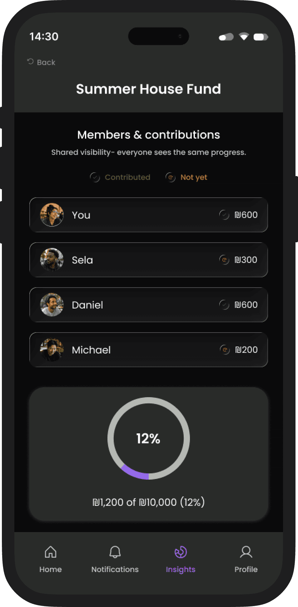
Contribution status is visible at a glance (Contributed / Not yet)

Contribution status is visible at a glance (Contributed / Not yet)

One shared view keeps accountability calm and consistent

One shared view keeps accountability calm and consistent

Contribution Flow

What this enables: flexible inputs that feed the same shared model, whether you log manually or sync a bank.

What this enables: flexible inputs that feed the same shared model, whether you log manually or sync a bank.

What this enables: flexible inputs that feed the same shared model, whether you log manually or sync a bank.

Flexible input

Read-only bank sync

Trust by design

Start manual, connect later, read-only bank sync is optional

Progress is calculated the same way regardless of input method

Log expense & settle up

Log expense & settle up

What this supports: logging shared costs and settling up without turning money into a social tension point.

What this supports: logging shared costs and settling up without turning money into a social tension point.

Expense logging

Settle up

No social friction
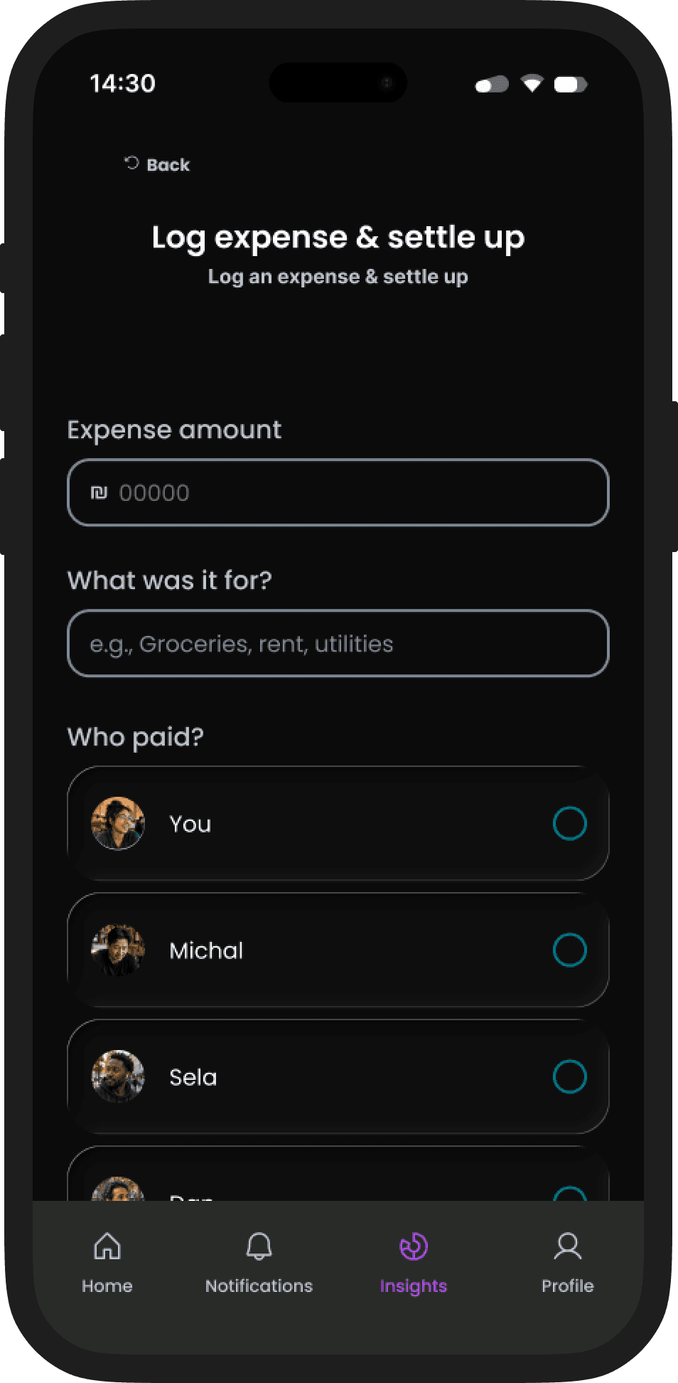
Quick logging with smart defaults for common shared costs

Quick logging with smart defaults for common shared costs

Clear settlements when it’s time to balance

Clear settlements when it’s time to balance

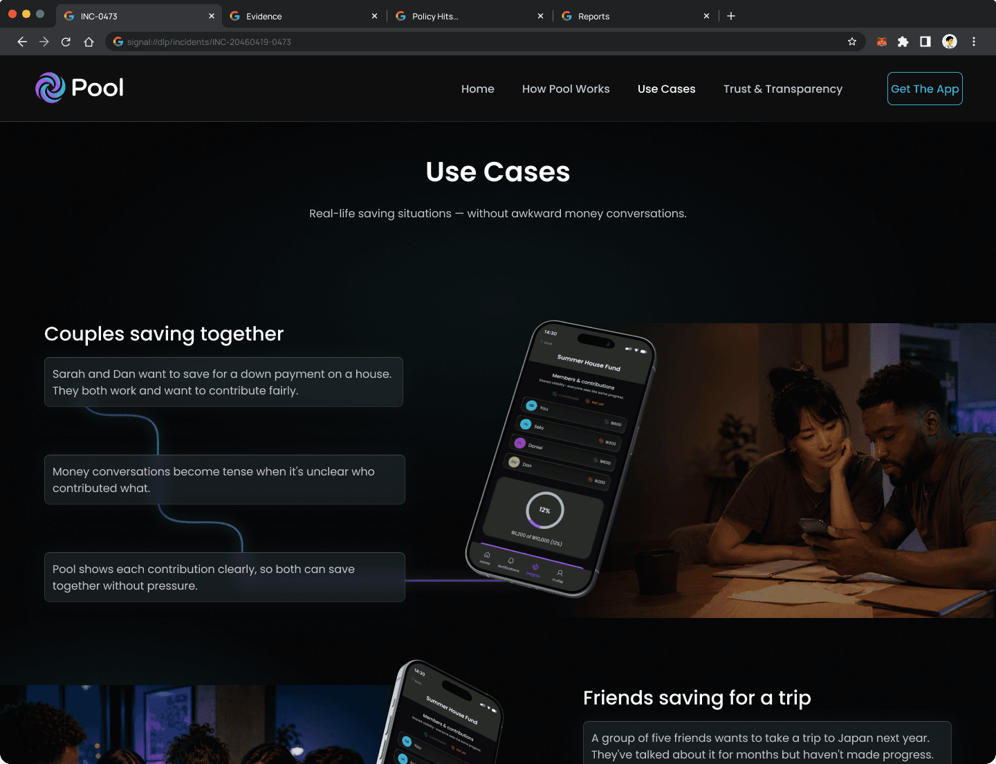
The App Needed a Front Door

The App Needed a Front Door

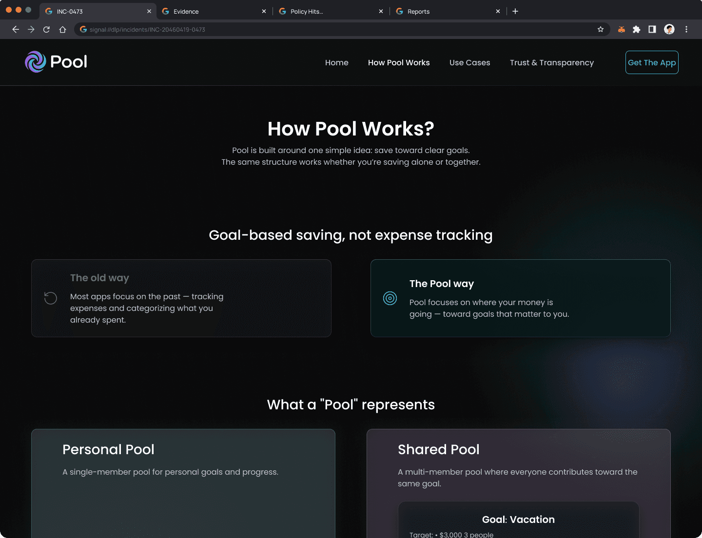
People don't download financial apps on impulse. Before committing, they need to understand the model, trust the product with their bank, and feel confident it won't create friction with their group. The app can't answer those questions on its own — so I designed a companion marketing website as a deliberate part of the product experience, sharing the same tokens, voice, and color system.

People don't download financial apps on impulse. Before committing, they need to understand the model, trust the product with their bank, and feel confident it won't create friction with their group. The app can't answer those questions on its own — so I designed a companion marketing website as a deliberate part of the product experience, sharing the same tokens, voice, and color system.

The Trust & Transparency page was designed to answer the question every potential user is silently asking before they hit download.

Outcome

Outcome

Pool demonstrates that shared saving can work when the system removes the social friction. The single mental model for solo and group goals, contribution status visible at a glance, and explicit read-only boundaries point toward a way to save together without the awkwardness of asking where the money went.

Pool demonstrates that shared saving can work when the system removes the social friction. The single mental model for solo and group goals, contribution status visible at a glance, and explicit read-only boundaries point toward a way to save together without the awkwardness of asking where the money went.

What I'd measure

Goal Completion Rate

Did the group reach its savings target? This is the core promise of Pool. Low completion signals either unrealistic goals or contribution drop-off along the way.

Goal Completion Rate

Did the group reach its savings target? This is the core promise of Pool. Low completion signals either unrealistic goals or contribution drop-off along the way.

Active Participation Rate

How many group members contribute consistently over time? One active member in a group of four is a UX failure, not a user failure.

Active Participation Rate

How many group members contribute consistently over time? One active member in a group of four is a UX failure, not a user failure.

Bank Connect Completion

What share of users who start the bank sync flow complete it? Drop-off here signals a trust or clarity problem in the permissions screen.

Bank Connect Completion

What share of users who start the bank sync flow complete it? Drop-off here signals a trust or clarity problem in the permissions screen.

What This Proves

What This Proves

Pool demonstrates that the same design system can serve solo savers and group savers without forcing users to learn two products. The key insight: people don't save in fundamentally different ways when alone or with others. They save toward a target, see progress, and adjust pace. By treating "shared" as a configuration of "personal" rather than as a separate product, Pool reduces cognitive overhead while opening the door to multi-user dynamics when they're useful. The transparency, the trust controls, and the manual escape hatches all serve a single thesis: design that respects users' agency over their money.

Pool demonstrates that the same design system can serve solo savers and group savers without forcing users to learn two products. The key insight: people don't save in fundamentally different ways when alone or with others. They save toward a target, see progress, and adjust pace. By treating "shared" as a configuration of "personal" rather than as a separate product, Pool reduces cognitive overhead while opening the door to multi-user dynamics when they're useful. The transparency, the trust controls, and the manual escape hatches all serve a single thesis: design that respects users' agency over their money.

If the work made sense to you,

let's talk.

Case Study
Case Study
Case Study

Zchut-AI | AI-Powered Civic Rights Platform

Designed a state-driven AI assistant that helps Israeli citizens discover and manage their social rights, with a focus on accessibility, transparency, and trust.
Role: Product Design & System Architecture (Independent Project)

Deliverables: Mobile app · Web dashboard · AI interaction system

Focus: AI transparency · Accessibility · Institutional trust

Bureaucracy wasn't designed for everyone

Israel's government services are fragmented, jargon-heavy, and increasingly digital-first. For two large population groups - seniors and new immigrants - this isn't inconvenient. It's exclusionary.

Isaac, 72 — Retired engineer, Tel Aviv
"I just want to know what I'm entitled to without feeling like I need a law degree to use an app."

Spends hours searching for health benefits he may already qualify for

Complex navigation and bureaucratic language trigger cognitive overload

Elena, 29 — Structural engineer, new immigrant, Haifa
"I can build a bridge, but I can't decipher this one-page letter from the tax office."

Fears missing critical deadlines due to language barriers

Has no reliable tool for interpreting official Hebrew documents in real time

Elena, 29 — Structural engineer, new immigrant, Haifa
"I can build a bridge, but I can't decipher this one-page letter from the tax office."

Fears missing critical deadlines due to language barriers

Has no reliable tool for interpreting official Hebrew documents in real time

RESEARCH INSIGHT

Our initial assumption: users need more information.

What we found: they need interpretation and confidence to act.

The information exists on platforms like Kol Zchut. The barrier is linguistic complexity and the anxiety of acting on something you don't fully understand.

One platform. Two interaction models.

Different tasks require different levels of AI involvement. The system separates deterministic processes from open-ended interpretation and routes each to the appropriate interaction model.

Guided Flow

Structured, step-by-step

Used for: eligibility checks, document submission, deadline tracking

Deterministic, clear inputs, clear outputs

Isaac: "Am I eligible for home-care benefit?" → structured checklist

Conversational AI

Natural language input

Used for: rights inquiry, document interpretation, escalation

Interpretive, ambiguous inputs, confidence-tiered outputs

Elena: scans tax letter → AI summarizes, flags urgency

Both models feed into the same underlying rights database. The interaction layer adapts; the data layer doesn't change.

The AI knows what it doesn't know

In a civic context, an AI that presents uncertain information with false confidence causes real harm - missed deadlines, wrong claims, financial loss. The system uses a three-state confidence model to make uncertainty visible before the user acts.

state
When it triggers
What the user sees
What the system does

Confident

Query is in-scope, high confidence score

Full answer + source tag

Logs interaction

Partial

Low confidence or edge-of-scope

Answer + "Verify with an advisor" warning

Flags for review queue

Escalate

Out-of-scope or critical legal domain

This requires professional review - no AI answer shown

Routes to advisor with full context

CONCEPT PROOF

Partial response detected. User sees inline caution state. Advisor queue entry created with full query context.

Escalation is a designed transition, not a fallback. The user sees the boundary before they hit it.

Design Decisions & Trade-offs

DECISION
Guided flow vs. open conversation

Structured flows reduce cognitive load for deterministic tasks. Conversational AI handles ambiguity. Separating the two prevents the system from feeling unpredictable.

Trade-off
Transparency vs. simplicity

Showing confidence states adds cognitive overhead. But hiding uncertainty in a civic context causes more harm than complexity. We chose to show the seams.

Trade-off
Escalation as a feature, not a fallback

Routing to a human advisor could feel like failure. We reframed it as a designed transition: the user sees the boundary before they hit it.

CONCEPT PROOF

Partial response detected. User sees inline caution state. Advisor queue entry created with full query context.

AI Data Flow & Extraction

To minimize cognitive load, the system acts as a "translator" between human natural language and complex bureaucratic requirements. Instead of forcing users to navigate through tedious forms, an LLM engine processes unstructured input—such as voice recordings or free text—extracts relevant entities (dates, names, statuses), and maps them directly into structured form fields. This architecture preserves the simplicity of a conversation while delivering the precision of a structured legal document.

Unstructured Input

Voice recordings or free text input from the user.

LLM Processing

NLP identifies intent and extracts key data entities.

Structured Output

Data is automatically injected into standard form fields.

Key Screens

Each screen resolves a specific tension between accessibility and trust.

14:30

שפה

שלום יצחק

עודכנו עבורך זכויות וסטטוסים רלוונטיים

צפה בעדכונים

סרוק מסמך

ה-AI יפרש אותו עבורך

חיפוש קולי

העוזר הקולי זמין לשאלות

הזכויות שלך

מאושר

הנחה בחשמל לאזרח ותיק

עודכן לאחרונה 20/01

בטיפול

קצבת זקנה (אזרח ותיק)

עודכן לאחרונה 20/01

מאושר

סיוע בשכר דירה

עודכן לאחרונה 20/01

הגדרות

מסמכים

מעקב

חיפוש

דף הבית

Home Dashboard (Mobile)

Global Search

Global Search

Global Search

Proactive Alerts

Proactive Alerts

Proactive Alerts

Quick Access

Quick Access

Quick Access

What this proves: A senior user can understand their rights status, pending actions, and new entitlements at a glance without navigating menus.

Personalized rights summary surfaces proactively based on user profile, not search

Status indicators distinguish between 'available now,' 'pending,' and 'requires action' without legal jargon

Voice Assistant (Mobile)

Barrier-Free Input

Barrier-Free Input

Barrier-Free Input

Natural Language

Natural Language

Natural Language

Zero Literacy Friction

Zero Literacy Friction

Zero Literacy Friction

What this proves: Voice input isn't a feature. It's an accessibility requirement for users who find typing in bureaucratic contexts intimidating.

Waveform UI provides real-time feedback that the system is listening and processing

Input is transcribed and confirmed before the AI responds, reducing anxiety about being misheard

14:30

שפה

חזור

עוזר קולי

האם מגיעה לי הנחה בארנונה..

סיים הקלטה

14:30

פלאש

חזור

מזהה מכתב מביטוח לאומי...

החזק יציב

המסמך ייסרק וינותח אוטומתית

צלם

העלה מהגלריה

Document Scanner / AI Chat (Mobile)

Capture in Context

Capture in Context

Capture in Context

On-Device Action

On-Device Action

On-Device Action

From Paper to Insight

From Paper to Insight

From Paper to Insight

What this proves: A new immigrant can resolve white-envelope anxiety in under 60 seconds.

OCR scan feeds directly into AI interpretation — no manual re-typing

AI response includes urgency classification: 'routine update' vs. 'deadline detected'

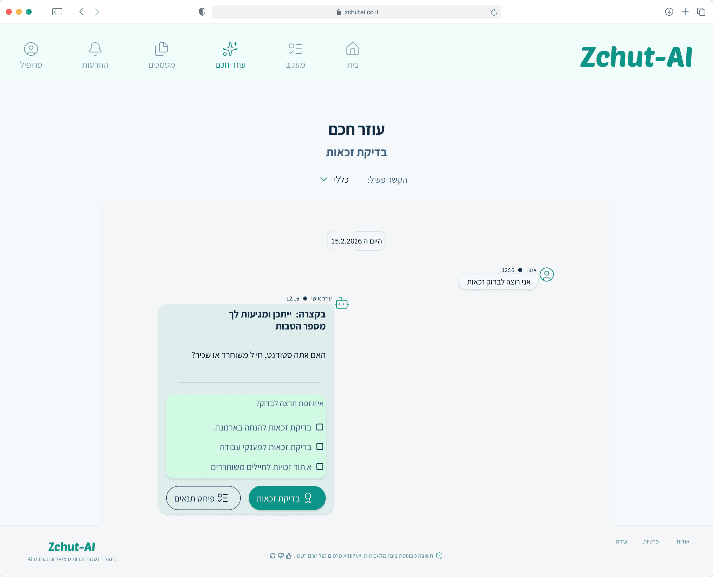
AI Chat with Escalation (Desktop)

Guided Exploration

Guided Exploration

Guided Exploration

Conversational Depth

Conversational Depth

Conversational Depth

No Legal Jargon

No Legal Jargon

No Legal Jargon

What this proves: When the AI reaches the edge of its competence, the handoff to a human is visible, designed, and context-preserving.

Escalation trigger is shown inline. The user understands why before they're redirected.

Advisor receives full conversation context. The user does not need to re-explain.
Benefits Dashboard with Deadlines (Desktop)

Full Picture View

Full Picture View

Full Picture View

Status at a Glance

Status at a Glance

Status at a Glance

Actionable Overview

Actionable Overview

Actionable Overview

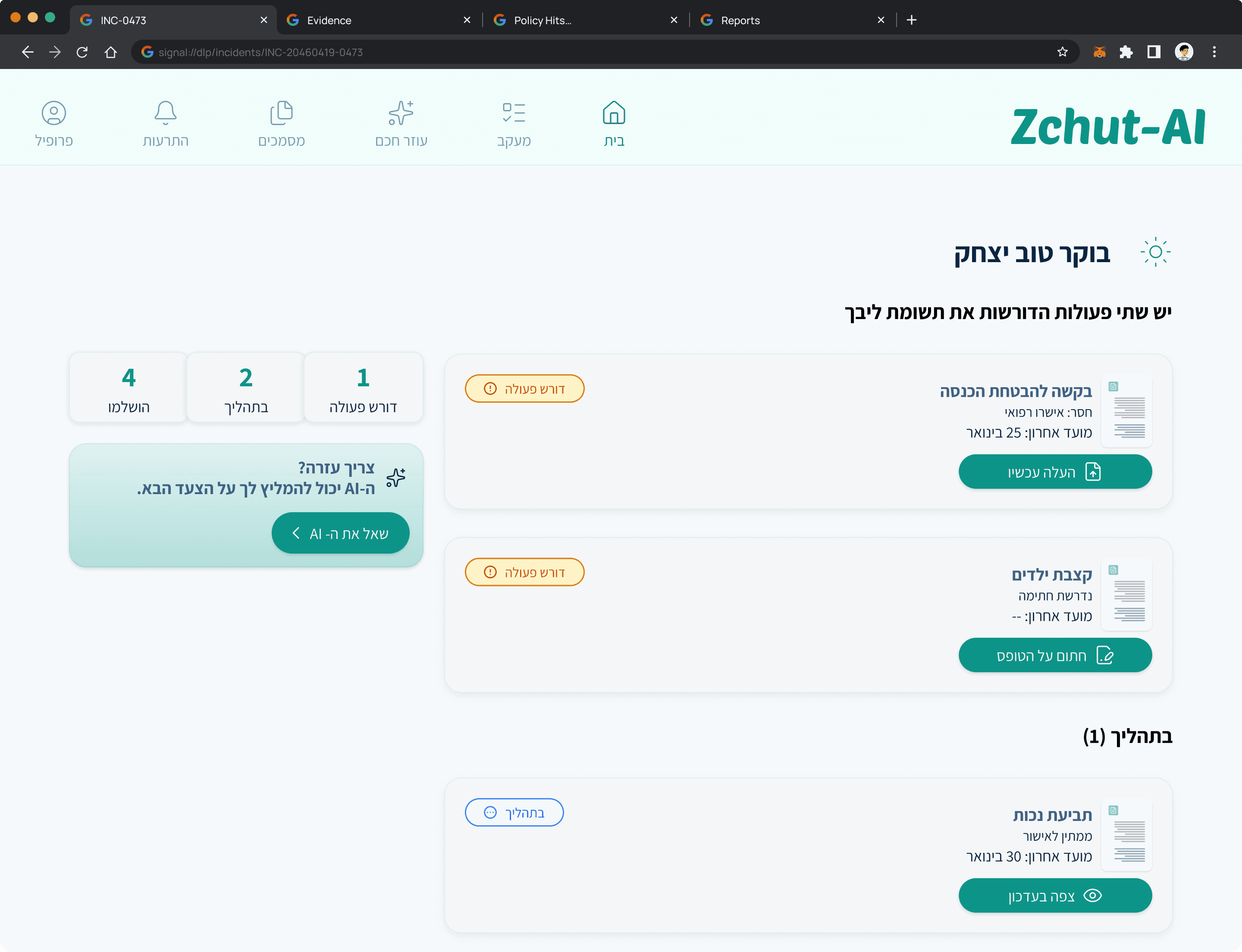
What this proves: The system's value isn't just answering questions. It's proactively surfacing entitlements users don't know to ask about.

Deadline tracking is visible and calendar-integrated, removing the fear of missing a critical date.

Progress indicators show where each benefit claim stands in the submission process

Outcome

Zchut-AI demonstrates that designing for extreme users - those most excluded by existing systems - produces a better product for everyone. The dual interaction model, confidence-tiered AI, and escalation system aren't accessibility features bolted on. They're the core architecture.

The project also proves a broader design thesis: AI in high-stakes civic contexts requires a trust layer, not just a response layer.

What I'd Measure

Rights Claim Completion Rate

The core promise of the product is that users successfully claim what they're entitled to. Low completion rates signal friction in the guided flow or insufficient clarity in the AI's responses.

Rights Claim Completion Rate

The core promise of the product is that users successfully claim what they're entitled to. Low completion rates signal friction in the guided flow or insufficient clarity in the AI's responses.

Escalation-to-Resolution Rate

Escalation only works if the handoff leads somewhere. Tracking whether users who reach a human advisor actually resolve their issue tells us whether the transition is designed well or just a dead end.

Escalation-to-Resolution Rate

Escalation only works if the handoff leads somewhere. Tracking whether users who reach a human advisor actually resolve their issue tells us whether the transition is designed well or just a dead end.

Return Usage by Primary Personas

If Isaac and Elena come back, the product has earned their trust. Return rate by persona type is a direct signal of whether the accessibility and language decisions are working in practice.

Return Usage by Primary Personas

If Isaac and Elena come back, the product has earned their trust. Return rate by persona type is a direct signal of whether the accessibility and language decisions are working in practice.

If the work made sense to you,

let's talk.

© 2026 Guy Bar-Sinai